Funny, but I don't think this is entirely true.
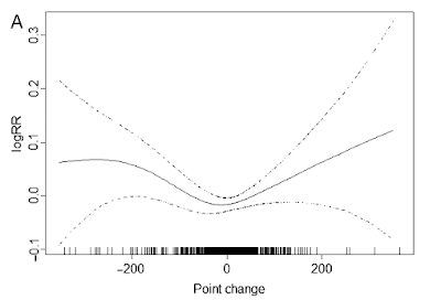
The chart below explains on the x-line it's the daily point changes in the Shanghai composite, and on the y-axis, it's the changes in the rate of coronary death on those days. Well, there are the fewest heart attacks on days when the stock market moves the least.
Read here for more.

The chart below explains on the x-line it's the daily point changes in the Shanghai composite, and on the y-axis, it's the changes in the rate of coronary death on those days. Well, there are the fewest heart attacks on days when the stock market moves the least.
Read here for more.


Comments